Color
To ensure that both low vision and colorblind users can access your site properly, there should be proper contrast between the foreground and the background. Avoid using color alone to convey information.
Color Contrast
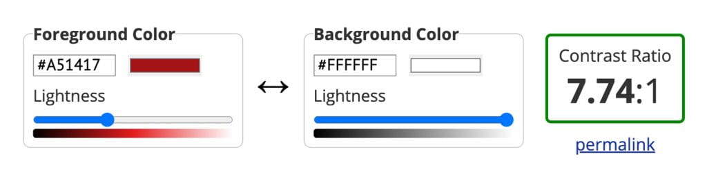
Sufficient contrasts between foreground text and the background is needed so it can be read by people with moderate low vision. The contrast recommendations are listed as a ratio of foreground to background.
Normal Text
Requires a minimum contrast ratio of 4.5:1
Large Text
Large-scale text has a contrast ratio of at least 3:1. Large text is defined as at least 14 point (18.66 pixels) and bold, or 18 point (24 pixels) or larger.
Incidental
Text or images of text that are part of an inactive user interface component, that are pure decoration, that are not visible to anyone, or that are part of a picture that contains significant other visual content, have no contrast requirement.
User Interface Components
Requires a minimum contrast ratio of 3:1. Examples of user interface components include: buttons, checkboxes, dropdown menus, arrows.
Graphical Objects
Parts of graphics required to understand content, such as a bar chart, also must have a minimum contrast ratio of 3:1. Exceptions for when a particular presentation of a graphic is essential to the information being conveyed.
Reference: 1.4.3 Contrast Minimum, 1.4.11: Non-test Contrast
WashU Sites have been designed to meet color contrast standards so you should not try to manually change font colors as it may cause accessibility issues. However, if you are adding custom logos, graphics, or graphs, you should test the contrast between the text and background.
Tools
If you need to test color contrast, there are several free tools available:
Use of Color
Avoid using color alone to convey information, indicating an action, or prompting a response. Color blind users may have difficulty discerning differences in color.
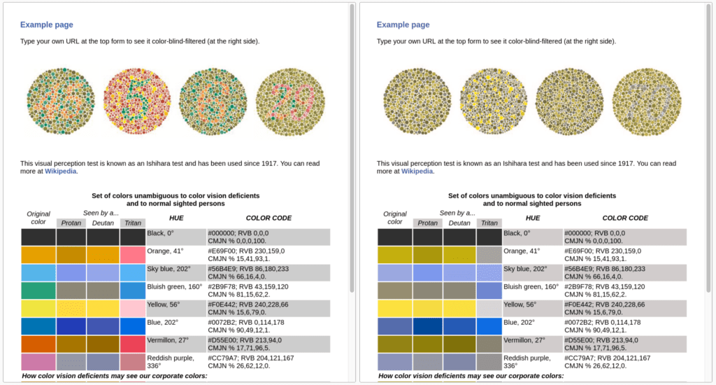
Graphs and charts
Graphs and charts can be hard to understand when only color is used for labeling.
The addition of textures, patterns, or shapes along with high contrast colors can help communicate the information. One way to test this is through printing out your chart or graph in black and white to see if you can still understand the information. Another method is checking with a color blind web page filter.
Reference: 1.4.1 Use of Color